
What You Need to Know About Mobile Web Design: How Should a Mobile-Friendly Site Be?
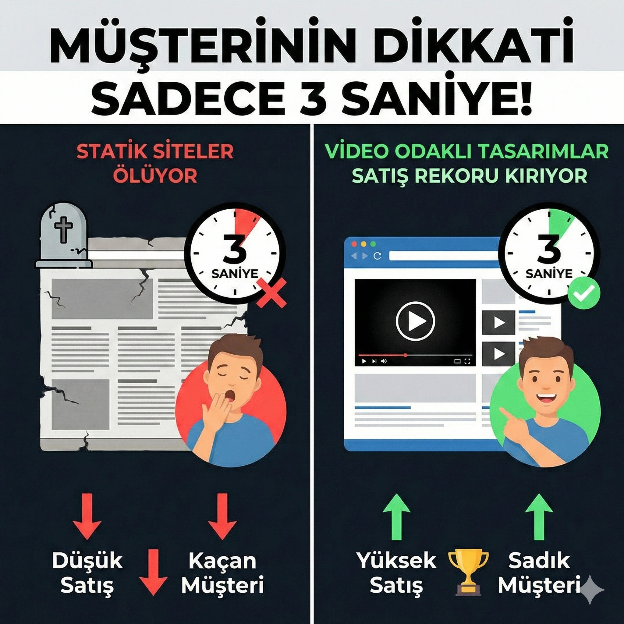
Customer Attention is Only 3 Seconds! 'Static' Sites Are Dying, Why 'Video-Oriented' Web Designs Break Sales Records?
.webp)
Don't Be Invisible on Google Maps: 5 Critical "Local SEO" Strategies to Carry Your Business to the Top (2026 Guide)

Are You Still Tracking Your Customers in Excel? The 'Hidden' Mistake Costing Your Business Money Every Month

Is Your Website Just an 'Ornament' or Your 'Digital Headquarters'? The Difference Between Being Present and 'Being Powerful' Online

What is Web Design? Is it Just a 'Good Looking' Page or a 24/7 Sales Person?
"The future is not in mobile; the future is "inside mobile"."
A Customer Base That Never Lets Go of Their Phone
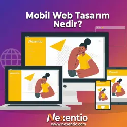
What is Mobile Web Design (Responsive)?
Technical Definition: It is the automatic shaping of contents on the website (image, text, video, menu) according to the screen size used by the visitor (Phone, Tablet, Laptop). Merchant Definition: Your site being "like water". If you pour water into a glass, it takes the shape of the glass; if you pour it into a pitcher, it takes the shape of the pitcher. A good website is like this too; it looks perfect on an iPhone, on a Samsung tablet, and on a giant monitor. This is called "Responsive Design" in the world.
Why "Must Have" Instead of "Nice to Have"?
As a business owner, you might think "My site looks very stylish on the computer, is mobile that important?" Here are 3 heavy costs of neglecting mobile: 1. Google Punishes You (Mobile-First Indexing): Google now looks at the mobile version of your site, not the desktop version, to understand how good it is. If your site is slow or faulty on mobile, Google throws you to the back pages in search results. 2. "Fingertip" Experience (User Experience): Customers use their "Thumb" on the phone. If your buttons are too small or menus are intertwined, the customer gets frustrated. A comfortable customer is a buying customer. 3. Speed and Patience Test: Mobile users are in a hurry. They won't wait if your site opens in 5-6 seconds. Professional mobile design ensures the site opens at lightning speed.
5 Concrete Benefits of Professional Mobile Design for Your Business
1. Your Revenue Increases: Your conversion rates (Sales/Appointment) rise. 2. Your Brand Image Strengthens: It gives a message of being corporate and reliable. 3. Your Advertising Cost Decreases: Google Ads loves mobile-compatible sites and reduces Cost Per Click (CPC). You attract more customers with the same money. 4. Management Becomes Easier: You manage all devices from a single panel. 5. Wider Audience: You reach students using tablets or housewives traveling with mobile phones.
Conclusion: Fit Your Website in Your Pocket
Let's explore your business's digital potential together. Get in touch now and let's create the difference together.
Let's explore your business's digital potential together. Get in touch now and let's create the difference together.